
Health Assessment Redesign
Product Overview
The health assessment is an online survey that captures the current state of a member’s health. This product provides the client more insights into the health of their member base and functions as a way for our digital platform to personalize the user’s experience. The activities a user is recommended is based on the data provided in the health assessment. For example, if a user inputs low or high blood pressure numbers the wellness portal will recommend activities and content related to improving their blood pressure.
Problems and Project Scope
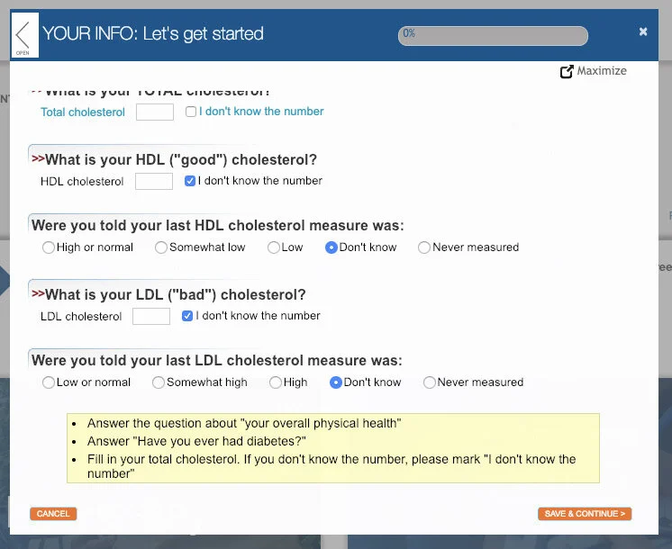
Screenshot of the previous health assessment before the redesign.
The health assessment is the most heavily promoted activity a user is asked to when joining the Onlife Health program. Users are incentivized to complete it and as a result it has a high completion rate. Due to the high completion rate the feature was left virtually unchanged for several years leading to the following problems:
The product failed to meet a number of basic web accessibility compliance requirements outlined in Section 508
It also was not fully responsive which made it more difficult to complete on smaller devices and browsers
The UI was inconsistent with the rest of the application
Various usability issues were identified
Scope
The primary goal was to make sure the product met 508 compliance web accessibility standards and make it visually cohesive with the rest of our digital products.
Roles and Responsibilities
Role
I worked as UX/UI designer on a team that included a project manager, product owner, another UX designer, a team of developers and a subject matter expert for the clinical aspect of the product.
Responsibilities
User research
Wireframes and Prototypes
User Testing
Hi-fi design
Collaborated with Developers for implementation
Participated in the QA Process
Process
Research
The team started with reviewing member, client and stakeholder feedback related to the current implementation of the survey.
I conducted some competitive analysis by reviewing similar health assessment products in the industry and also read about best modern practices with designing online forms. One thing I learned that influenced the project was to reduce cognitive load by breaking things into smaller chunks of content. It is a lengthy survey so it was important to do everything we could to avoid overwhelming the user.
Design and Testing
I sketched some ideas and discussed them with the team. I turned the sketches into a working prototype which we tested on usertesting.com. This test was to ensure people knew how to access it and were able to get through it without issue and comprehended the redesigned layout of the design.
Implementation
After this we continued to discuss the design with development and iterated as we learned more about some of the constraints we would be dealing with. I then provided mockups and documentation to ensure a smooth design-to-development handoff. I documented the various question types and input states that needed to be accommodated for and an Adobe XD doc that could be inspected for better design guidance for the development team.
Once a functioning version of the feature was ready I participated in the QA process by taking the survey and identifying bugs and defects.
The clip above shows the interaction where a user completes a portion of the survey and receives a “snapshot report” to communicate how their health fares in comparison to recommended health metrics.
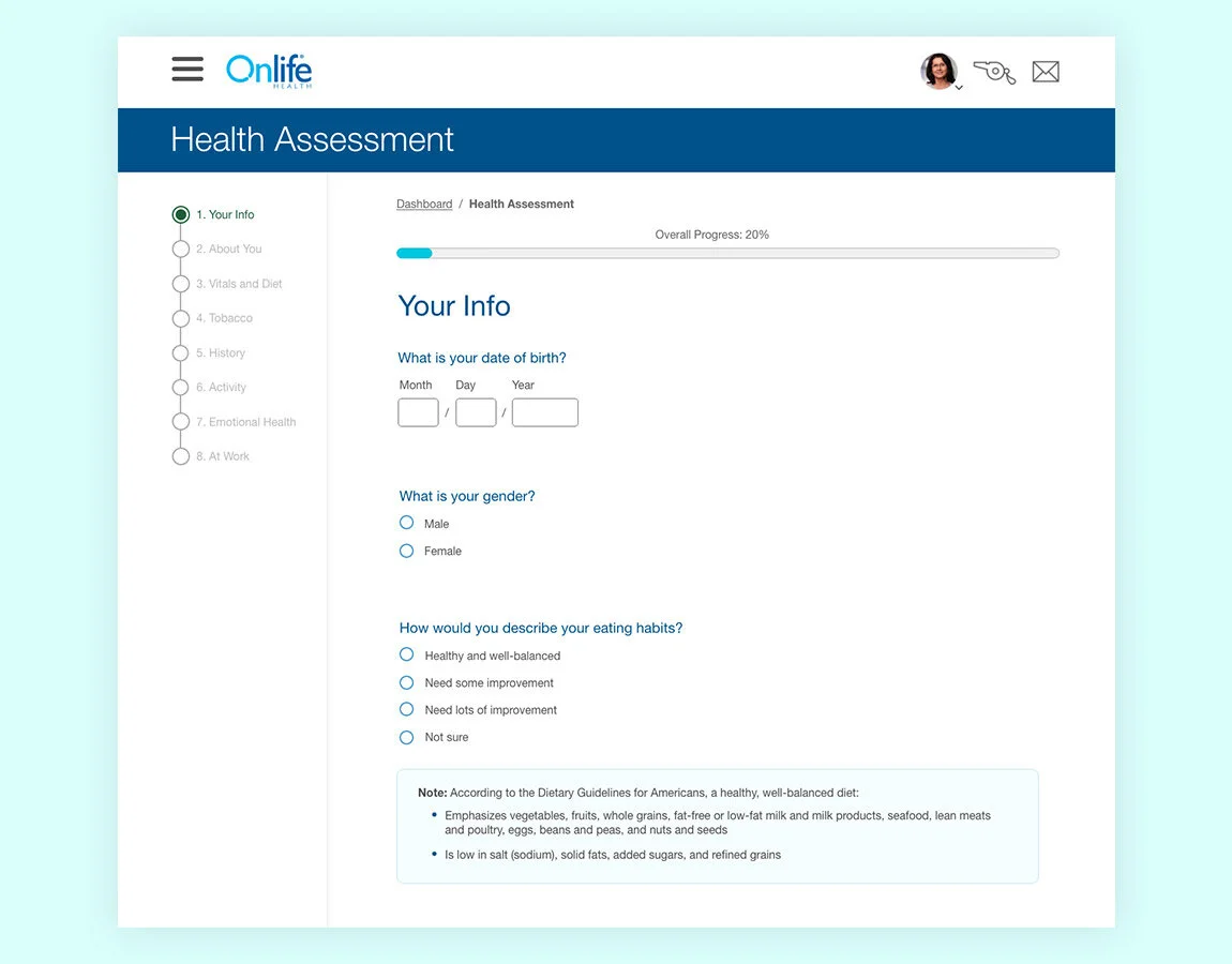
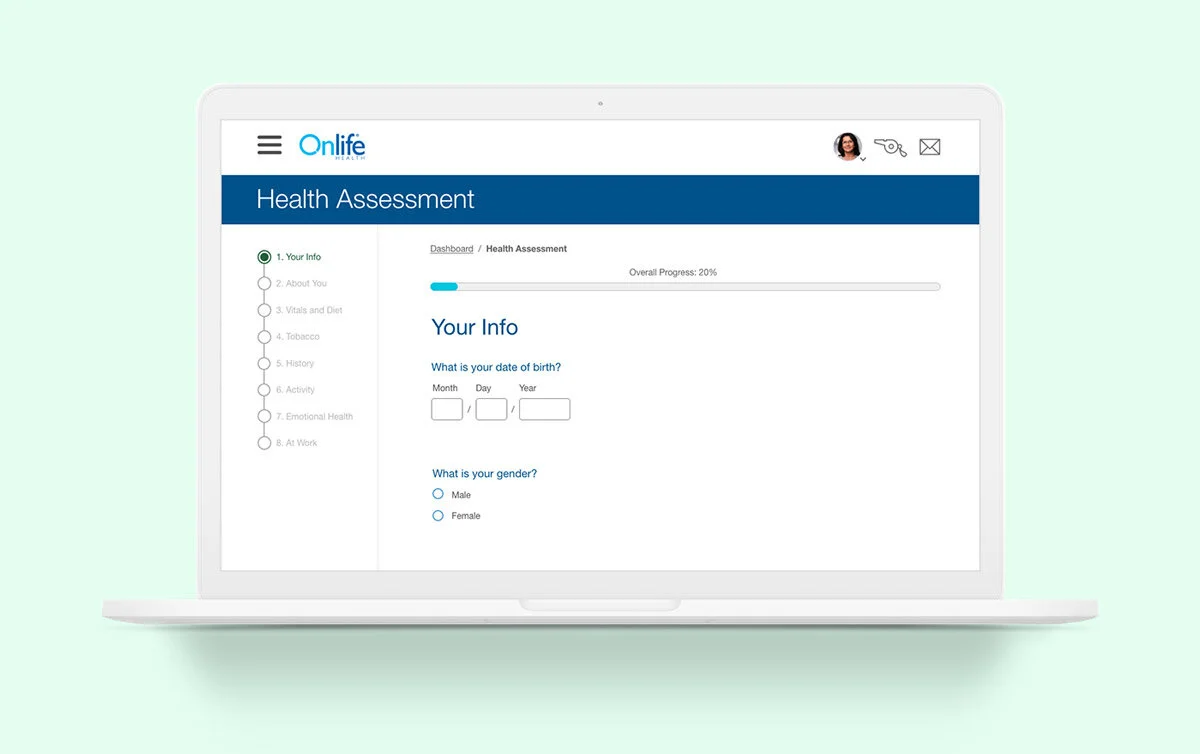
This is the first section of the assessment. It is quite lengthy so it was important to break it down into bite-sized chunks and show a clear indicator of progress.
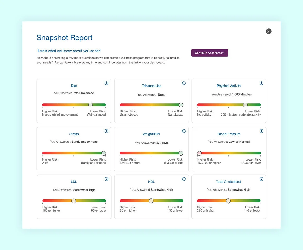
This is the snapshot report. It appears after a segment of the survey has been completed to give the user and idea of how their numbers compare to clinical norms.
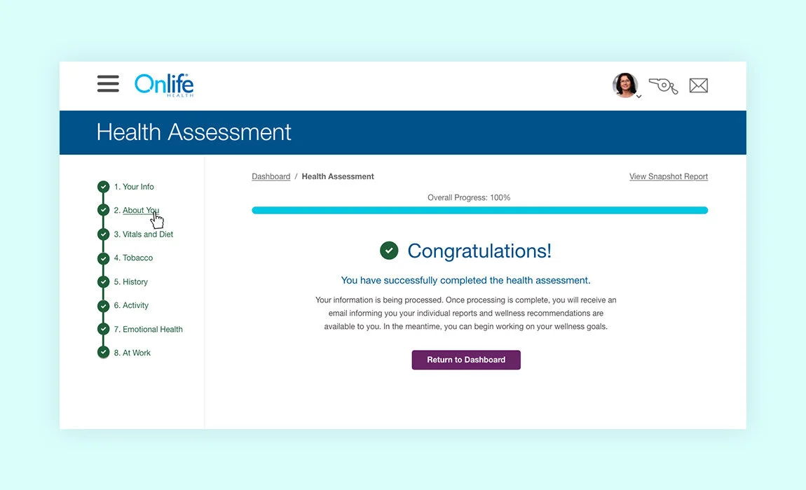
Once the user completes the assessment they are informed of the results via an email and a report inside the web portal. The data they enter is also used to provide a personalized experience and tailored recommended activities in the application.
Outcomes
The product was released to positive client feedback. We now have a fully responsive, accessible health assessment that sets us up for the future. We’ve also established new form components that will be utilized throughout the application.
Next Steps
The next step is to continue collecting and assessing user feedback and respond to those in future releases. There are a number of ways we are already looking to improve the application that will be addressed in the next phase of the project.